Sherwin-Williams 2024

2024 Sherwin-Williams Color of the Year – Upward into the Blue

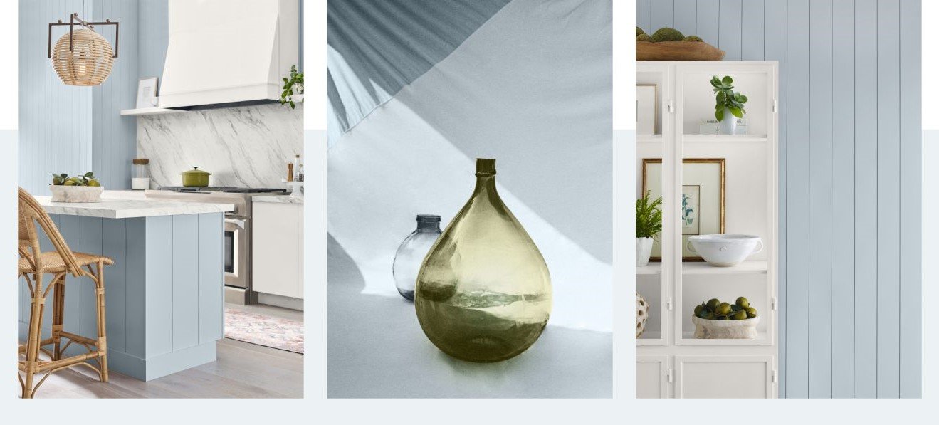
With their 2024 Color of the Year concept broadened to a group of paint colors, one of which is named Persimmon, mentioned here previously, the Sherwin-Williams Color Collection of the Year also offers Upward SW6329. Described rather poetically as “a breezy shade of blue” by Anne Flynn Wear, Assistant Managing Editor of Home Accents Today, we’ve labeled the hue as simply lovely.

Having said that, Upward appears to be quite a versatile shade, as are so many of the innumerable tones of blue available from virtually every paint, textile, and floor and wallcovering manufacturers.

To be honest, we have always found the concept of declaring a “Color of the Year” by anyone to be more than a little bit arrogant, as well as decidedly pretentious. After all, it’s not as if the entire industry will accept said color and use nothing else, regardless of which entity proclaims it to be The One.

So yes, it does make at least a modicum of sense for Sherwin-Williams to offer a “Color Collection of the Year”. And why shouldn’t they? It makes just as much sense, and creates as much confusion, as trying to decipher the contrasting and conflicting choices presented by the many paint manufacturers relative to each other.

Onward and Upward for the New Year

As we said before, we find Upward (SW6329) to be a lovely and subtle hue that offers a homeowner a sense of tranquility, if not downright serenity, regardless of the space in which it is used. When combined with other colors from the Collection, such as Waterloo (HGSW9141), Friendly Yellow (HGSW6680), Pearly White (HGSW7009), or even the previously mentioned Persimmon (HGSW6339), the homey shade of blue appears to be the perfect anchor color for any space.

And, so, we offer these declarations from the manufacturer themselves: 

  • A HINT OF SILVER LINING – Introducing Upward, a breezy, blissful blue. The color found when we slow down, take a breath, and allow the mind to clear.

  • RELAXED + CAREFREE – A sunny-day shade for spaces brimming with positive energy, creative thinking, and total contentment.”

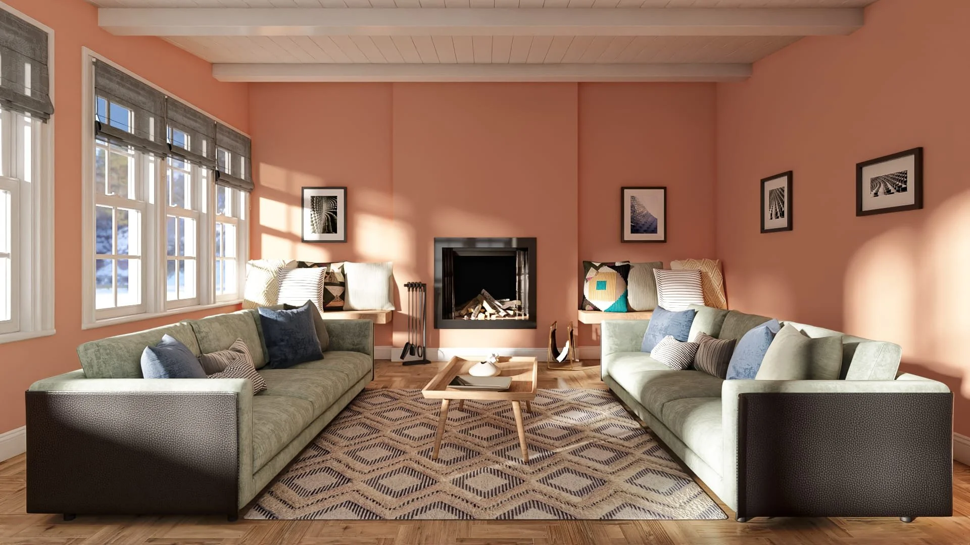
From kitchens to living rooms and from bedrooms to bathrooms, we are convinced this enticing shade of blue can be used as the center point of any color palette. Whether used as a calming background for more striking colors and patterns on furnishings or as the carefree focus of more laid-back spaces, we wholeheartedly approve of the choice made by Sherwin-Williams for next year.

From the moment we saw it, we had no trouble imagining how Upward (SW6329), the 2024 Sherwin-Williams Color of the Year, might be exploited by interior designers and furnishing dealers to reimagine the client’s spaces. However, if you can’t quite see it, feel free to ask for a design business consultation with Ted. Simply… Contact TD Fall today.

Colors of the Year – Will Paint Companies Contrast or Conflict? Yes!

As we shared in an earlier post, Valspar Paints is marketed separately from its parent, Sherwin-Williams. Yet, even so, we were still a bit surprised at the contrast (née conflict?) between the two companies' choices for their latest Colors of the Year.

Without even seeing them, the names alone tell much of the story, with a bold name like Ironside from Valspar contrasting with the far softer-sounding Persimmon from Sherwin-Williams.

Sherwin-Williams 2024 Color Collection of the Year

In addition to its new Color of the Year, as mentioned above, the paint manufacturer has also unveiled its 2024 Color Collection of the Year, Renewed Comfort. Filled as it is with gentle neutral colors that are “restful and restorative”, Persimmon sets the mood, as well as the foundation for the Collection as an “earthy terracotta infused with tangerine tones”.

With a nod of the head to the folks at HomeAccentsToday.com, and including extensive quotes from the paint company we share the following: “The Renewed Comfort Color Collection is composed of shades that embody tranquility, comfort, and rejuvenation.”

“The … Collection is restful and restorative with an expressive touch to showcase unique personal style – bringing a sense of comfort into the home with a new, refreshed outlook,” said Ashley Banbury Sherwin-Williams color marketing manager.

“Customers can mix and match shades from the Color Collection to make a statement, giving space to feel renewed with comfort,” she added.

Sherwin-Williams 2024 Color of the Year

“Persimmon is a grounded earthy terracotta shade that feels energetic and refreshing…. [with] warm, earthy elements [that] add an uplifting personal touch to the home.”

“Persimmon balances the energy of tangerine with grounded neutral undertones, making it perfect for spaces like living rooms and kitchens as it promotes positive relationships and conversation. The beautiful shade helps rejuvenate a space while bringing unique design visions to life,” Banbury said.

Available exclusively at Lowe’s stores, the designer-inspired 2024 Color Collection of the Year includes 10 neutrals combined with bright shades that create a new twist on traditional color combinations. Persimmon, the 2024 Color of the Year, brings a sense of comfort into the home with natural hues to soften the space, according to Ms. Banbury.

As you can see, our cautionary notes were valid, considering the broad range and contrast of colors from two brands covered by a single umbrella.

As always, Ted remains available for business consulting to the trade, whether you have questions about colors or basic business practices. Simply… Contact TD Fall today.