Color Trends 2024

Your Future – How to Know What’s Next for Your Business

In all probability, the sun will rise tomorrow; just as it will also set, and night will replace day. We believe in the certainty of this taking place based on experience, history, the current state of affairs, and sciencey stuff that is beyond us yet in which we have faith. So, there is a fairly inevitable part of your future but, there are many areas where we believe we can never know what’s next.

For example, what the heck will your teenage daughter or son be doing with their friends after the Big Game Saturday night? What color and fabric will her prom dress be? When will he (if ever) start taking his curfew seriously?

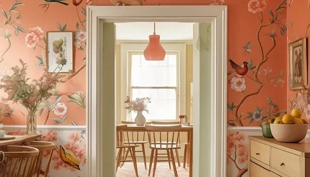
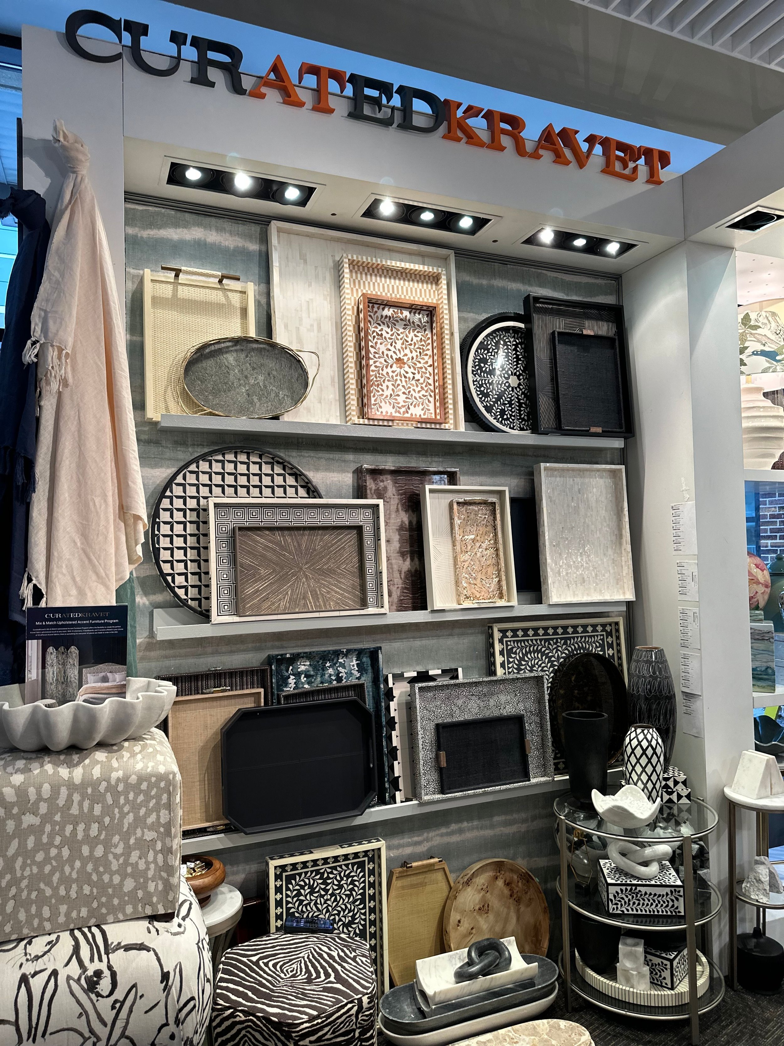
Teenagers aside, predicting the future is not only difficult, but it can also be dangerous. For example, while certain luxury furnishings may have a great track record for dealer sales, trends change, shapes become overdone or obsolete, and colors of the year will shift, well – yearly. And yet… And yet… a good buyer is an informed buyer, using experience, history, trends, and market research to avoid over- and under-buying product that is likely to be in demand next season.

What Will Tomorrow Bring?

“Challenging the belief that the future is unknowable,” futurist Rebecca Costa believes in a “series of [what she identifies as] ‘knowables’ that can be possessed about most any given situation based on history, current circumstances, and myriad other algorithms that allow for reasonably accurate predictive outcomes.” (FurnitureToday.com)

“To help companies systemize their efforts to confront complex change, she outlined six steps: identifying the challenge or need; categorizing opportunities into market-driven (incremental) change or ‘moonshots’ (higher risk, higher reward) opportunities; developing separate processes for each of those two categories; realigning talent around personality predispositions; evangelizing from the top-down; and systematizing and institutionalizing [what she describes as] a ‘predaptive’ culture.”

“The most notable change from more traditional business practices is the development of separate processes for market-driven opportunities and so-called moonshots, and the corresponding alignment of talent accordingly.”

“Costa outlined two personality types common to professional organizations which she termed ‘racers’ and ‘climbers’. Racers are expert multi-taskers, highly verbal, high energy, performance-oriented, and are easily frustrated by process and protocol. Conversely, climbers are persistent, analytical, evidence-driven, process-driven, and prefer written communication.”

“Companies that use a single process for market-driven and moonshot initiatives often have these types of individuals working together, which often frustrates each and stifles development. Costa’s advice is to separate the processes and the individuals with racers focused on market-driven developments and climbers focusing on moonshots.”

Keeping It Simple

If that doesn’t make your head spin...

From our perspective as mere forecasters and experienced business prognosticators based on current trends and experience (We certainly do not claim to be futurists), we will try to simplify a predictive model that works for us:

  • Be objective and uncompromising as you evaluate your business.

  • Pay attention to local market forces as well as trends you see in the trade.

  • Be conservative in your vision of the future of the market and your place in it.

  • Take things to their logical, inevitable conclusion.

  • Prepare yourself for anything.

And never forget – interior design is a local business!

Ted remains available for his impressions of issues like these and for business consulting to the trade. All you have to do is… Contact TD Fall today.

Pantone Color of the Year 2024: Peach Fuzz

Yeah, no! We are not referring to the fine hair many women grow on their faces, known as Vellus hair. (And no, removing by shaving or other means will NOT make it grow back thicker or darker.) Rather, we are somewhat entranced by the latest Pantone Color of the Year, labeled Peach Fuzz (13-1023).

According to the influential color consultancy, “Peach Fuzz captures our desire to nurture ourselves and others. It's a velvety gentle peach tone whose all-embracing spirit enriches mind, body, and soul.”

“In seeking a hue that echoes our innate yearning for closeness and connection, we chose a color radiant with warmth and modern elegance. A shade that resonates with compassion, offers a tactile embrace, and effortlessly bridges the youthful with the timeless.” Leatrice Eiseman, Executive Director, Pantone Color Institute™

Everything’s Peachy with Pantone 2024

While these descriptions may seem a bit of a reach for a mere color, the company is not pulling its punches and refuses to settle for less. “In home design, Peach Fuzz creates a welcoming ambiance … and can promote feelings of warmth whether it is used on a painted wall or as an accent within a pattern.” (HomeAccentsToday.com)

“A cozy peach hue softly nestled between pink and orange … Peach Fuzz brings belonging, inspires recalibration and an opportunity for nurturing, conjuring up an air of calm, offering us a space to be, feel, and heal and to flourish from whether spending time with others or taking the time to enjoy a moment by ourselves,” expounded Ms. Eiseman.

“Drawing comfort from Pantone Peach Fuzz, we can find peace from within, impacting our wellbeing. An idea as much as a feeling, Peach Fuzz awakens our senses to the comforting presence of tactility and cocooned warmth.”

Whether you believe a gentle, cozy, and warm color like Peach Fuzz (13-1023) can achieve all of these things through the use of paint, wallpaper, furniture fabrics, rugs, and such, is a valid question. Yet, we do know this: each year the Pantone Color of the Year tends to shape “product development and consumer decisions in fashion, industrial and interior design, product packaging and other industry areas” every year. (npr.org)

There is little reason to doubt that next year will be no exception.

As always, Ted remains available for business consulting to the trade, whether you have questions about the various colors of the year for 2024 or basic business practices. Simply… Contact TD Fall today.

Interior Design Trends – Do They Even Matter?

This is the time of year when we are not only told what the Color of the Year will be in 2024; we are also deluged by so-called experts regaling us with what is supposedly trending in every category of our existence. Interior design trends are no different, of course. Yet, while we are cognizant of the fact that we must share some of these with you, we can’t help but wonder just how important such generalizations can be.

You see, a generalization is simply “The formulation of general concepts from specific instances by abstracting common properties.” (Power Thesaurus) Or, in other words, it is the broadening of specifics to abstractions or concepts.

And so, if you accept the declaration of a trend, you must then turn around and reduce it to something specific to apply it. That is, you must articulate a definitive use of the overall trend to meet each of your individual clients’ needs.

That’s a lot of work when you think about it. Especially when you consider color trends for example, as paint manufacturers declare various shades of blue, or green, or gray, or something else to be the next Big Thing.

Statistically, generalizations and trends matter – until you encounter a specific need or purpose for them. Then, they become nothing but a guide for your approach to a particular situation, or for an individual (i.e., a client)

And yet, we share articles and posts about interior design trends and other popular directions in luxury furnishings on the regular. And no, that does not make us hypocrites. Rather, we think it’s important to know what consumers and homeowners are being told about the latest trends in home design and furnishings so that we may guide you and you may guide them in their choices.

With all of that in mind…

Home Design Trends Happening Now

Again, interested homeowners regularly search for trendy solutions to their home design needs. For many, Houzz.com is a priority in their quest. Since it’s important to know what consumers are being told, we’d like to share a few of those things with you.

In the article linked above, author Mitchell Parker offers seven trends, of which three affect us directly: trending colors, tones, and styles.

As always, there are conflicts evident in not only trending colors but also in the shading and tones that seem to be popular. While you can never go wrong with neutral, earthy colors, combining them with vibrant tones can create contrasts that may lead to conflict and/or discomfort. You should be especially careful when following these trends.

“While warm neutrals are popular, some designers say they’re hearing a lot of requests for bold, saturated jewel tones,” he writes.

Backing farther away from his own declaration of the popularity of bold colors, Mr. Parker declares the ongoing celebration of timeless style in home design. Claiming that “Old is new again,” he quotes designer Alex Thies of Adelyn Charles Interiors as saying. “We are seeing a lot of even our most modern clients incorporate ‘old’ elements such as brick, handmade clay tiles, rustic wood elements, and arches everywhere. It’s a new eclectic ‘earthy modern’ vibe that we are here for.”

In other words, this particular trend is a departure from “trendy design styles” with an “appreciation for more timeless design choices.” As if resisting trendy home design choices is something new among designers and their clients. (Yeah, right!)

What Does This Mean?

Stated simply, while they can sometimes illuminate, declarations of home design trends merely illustrate that homeowners need a guide for the choices they are going to make. Since this is a pretty good job definition for interior designers and furnishing dealers, you should be aware of them but not let them control the choices you offer your clients.

Ted remains available to offer guidance when it comes to using conflicting home design trends to better serve your clients. With more than a quarter-century of experience in the trade, his business consulting services may be just what you need in these challenging times. Simply… Contact TD Fall today.

2024 Sherwin-Williams Color of the Year – Upward into the Blue

With their 2024 Color of the Year concept broadened to a group of paint colors, one of which is named Persimmon, mentioned here previously, the Sherwin-Williams Color Collection of the Year also offers Upward SW6329. Described rather poetically as “a breezy shade of blue” by Anne Flynn Wear, Assistant Managing Editor of Home Accents Today, we’ve labeled the hue as simply lovely.

Having said that, Upward appears to be quite a versatile shade, as are so many of the innumerable tones of blue available from virtually every paint, textile, and floor and wallcovering manufacturers.

To be honest, we have always found the concept of declaring a “Color of the Year” by anyone to be more than a little bit arrogant, as well as decidedly pretentious. After all, it’s not as if the entire industry will accept said color and use nothing else, regardless of which entity proclaims it to be The One.

So yes, it does make at least a modicum of sense for Sherwin-Williams to offer a “Color Collection of the Year”. And why shouldn’t they? It makes just as much sense, and creates as much confusion, as trying to decipher the contrasting and conflicting choices presented by the many paint manufacturers relative to each other.

Onward and Upward for the New Year

As we said before, we find Upward (SW6329) to be a lovely and subtle hue that offers a homeowner a sense of tranquility, if not downright serenity, regardless of the space in which it is used. When combined with other colors from the Collection, such as Waterloo (HGSW9141), Friendly Yellow (HGSW6680), Pearly White (HGSW7009), or even the previously mentioned Persimmon (HGSW6339), the homey shade of blue appears to be the perfect anchor color for any space.

And, so, we offer these declarations from the manufacturer themselves: 

  • A HINT OF SILVER LINING – Introducing Upward, a breezy, blissful blue. The color found when we slow down, take a breath, and allow the mind to clear.

  • RELAXED + CAREFREE – A sunny-day shade for spaces brimming with positive energy, creative thinking, and total contentment.”

From kitchens to living rooms and from bedrooms to bathrooms, we are convinced this enticing shade of blue can be used as the center point of any color palette. Whether used as a calming background for more striking colors and patterns on furnishings or as the carefree focus of more laid-back spaces, we wholeheartedly approve of the choice made by Sherwin-Williams for next year.

From the moment we saw it, we had no trouble imagining how Upward (SW6329), the 2024 Sherwin-Williams Color of the Year, might be exploited by interior designers and furnishing dealers to reimagine the client’s spaces. However, if you can’t quite see it, feel free to ask for a design business consultation with Ted. Simply… Contact TD Fall today.

Colors of the Year – Will Paint Companies Contrast or Conflict? Yes!

As we shared in an earlier post, Valspar Paints is marketed separately from its parent, Sherwin-Williams. Yet, even so, we were still a bit surprised at the contrast (née conflict?) between the two companies' choices for their latest Colors of the Year.

Without even seeing them, the names alone tell much of the story, with a bold name like Ironside from Valspar contrasting with the far softer-sounding Persimmon from Sherwin-Williams.

Sherwin-Williams 2024 Color Collection of the Year

In addition to its new Color of the Year, as mentioned above, the paint manufacturer has also unveiled its 2024 Color Collection of the Year, Renewed Comfort. Filled as it is with gentle neutral colors that are “restful and restorative”, Persimmon sets the mood, as well as the foundation for the Collection as an “earthy terracotta infused with tangerine tones”.

With a nod of the head to the folks at HomeAccentsToday.com, and including extensive quotes from the paint company we share the following: “The Renewed Comfort Color Collection is composed of shades that embody tranquility, comfort, and rejuvenation.”

“The … Collection is restful and restorative with an expressive touch to showcase unique personal style – bringing a sense of comfort into the home with a new, refreshed outlook,” said Ashley Banbury Sherwin-Williams color marketing manager.

“Customers can mix and match shades from the Color Collection to make a statement, giving space to feel renewed with comfort,” she added.

Sherwin-Williams 2024 Color of the Year

“Persimmon is a grounded earthy terracotta shade that feels energetic and refreshing…. [with] warm, earthy elements [that] add an uplifting personal touch to the home.”

“Persimmon balances the energy of tangerine with grounded neutral undertones, making it perfect for spaces like living rooms and kitchens as it promotes positive relationships and conversation. The beautiful shade helps rejuvenate a space while bringing unique design visions to life,” Banbury said.

Available exclusively at Lowe’s stores, the designer-inspired 2024 Color Collection of the Year includes 10 neutrals combined with bright shades that create a new twist on traditional color combinations. Persimmon, the 2024 Color of the Year, brings a sense of comfort into the home with natural hues to soften the space, according to Ms. Banbury.

As you can see, our cautionary notes were valid, considering the broad range and contrast of colors from two brands covered by a single umbrella.

As always, Ted remains available for business consulting to the trade, whether you have questions about colors or basic business practices. Simply… Contact TD Fall today.

Color Trends for 2024 – Paint Companies Jump the Gun!

Just last week we shared our surprise that paint companies in the US had already begun sharing what they believe will be the color trends for 2024; that is, their colors of the year. Whether we believe it’s too early for such predictions is irrelevant. They’re doing it and, as usual, we can only react.

Interestingly, though Valspar Paints is a Sherwin-Williams brand, they are marketed as a separate brand that offers its own 2024 Color of the Year and is sold exclusively at Lowe’s.

While perusing the internet for information on such, we stumbled upon HouseDigest.com where insight is offered into the importance of color for interior designers:

“Color is one of interior design's most important factors. Beyond creating an aesthetically pleasing room, color can help set the mood. Enveloping a room with the right color creates a setting that can relax or energize. However, choosing the right paint color can be an overwhelming choice for many homeowners. Luckily, many paint companies, including Valspar, choose a Color of the Year that's meant to forecast the interior design trends for the upcoming year.”

Having shared an even dozen “Colors of the Year” last year, Valspar has decided to select one color for 2024. Labeling it “Renew Blue”, Valspar has chosen a color that “is an incredibly versatile and all-season shade that anyone can envision in their space. The inspiration is rooted in nature and wellness, which can be achieved to help alleviate the anxiety in life.”

Valspar Offers a Sense of Wellness and Comfort

Even more important, Valspar offers a clearly stated reason for choosing Renew Blue as their Color of the Year for 2024:

WHY IT’S TRENDING: Most of us are seeking an end to feeling overwhelmed – less stress, less information, less technology, fewer choices. Simplicity. Here, we can slow down and create the peaceful place we seek.”

Colorful yet welcoming, Renew Blue from Valspar can be used to gently say, “Welcome to our home” to guests or, perhaps more importantly, deliver a loving “Welcome home” to family.

“The Valspar Color of the Year for 2024 is Renew Blue, ‘a balanced blue with a touch of grayed sea-green that focuses on wellness and comfort,’ according to the paint company. The shade is meant to create a restful feeling to transform a home into a place meant to prioritize self-care and well-being.” (House Digest)

And, this living room definitely looks like a comfortable place to feel well.

“Inspired by fleeting elements like fog, mist, clouds, and glacier lakes, Renew Blue elevates the everyday mood, encourages self-expression, and evokes a feeling of balance and calm, with a twist of unique spontaneity,” explains Sue Kim, Valspar Director of Color Marketing. “Blue is a classic shade that has become the new neutral for today's home and can be mixed and matched to fit a variety of design styles and applications.”

And, what better place to elevate one’s mood than the most popular room in virtually everyone’s home, their kitchen?

All of that said, it’s likely best to allow the paint company to speak for itself concerning Valspar’s 2024 Color of the Year:

“A nourishing, green-influenced blue that creates a sense of peace wherever you place it.”

A quick cautionary note: Don’t be surprised by the variety of colors, some of which will definitely contrast in both look and feel with those of others.

As always, Ted remains available for business consulting to the trade, whether you have questions about colors or basic business practices. Simply… Contact TD Fall today.