
Wait, wut? Well, we did mention that many paint brands have chosen various shades of green as their 2022 Color of the Year, unlike Pantone Very Peri which we happily featured in a previous post.
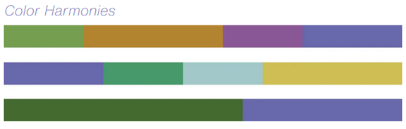
So, if you're struggling to imagine using a very periwinkle hue as the foundation for an upcoming interior design project, the industry has created options for you. (Whew, no ‘splaining why you chose it to a client – if you feared such a bold color might be.)
Then again, it’s doesn’t seem impossible to imagine using shades of both green and one of the four color palettes designed to complement the dynamic purple/blue hues of Very Peri from Pantone. After all, creativity is the hallmark of a sharp designer and, when a client shares their confusion about the conflicting opinions on colors of the year, your ingenuity and resourcefulness will ensure you have answers ready for them.
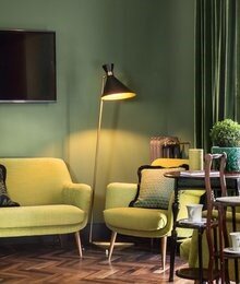
Why Is Green Suddenly So Trendy?
Both the question and answer are available in an article at Houzz.com. As San Francisco-based architectural color specialist and design writer Jennifer Ott explains:
“I’ve been asked by many homeowners why green is suddenly so hot in and on homes, and I think it’s for a variety of reasons. For one thing, after so many years of pure white and cool shades of gray and blue dominating interiors, I think folks are looking for warmer hues. Green can go warm or cool, but it’s especially good at taking the chill out of a room when paired with white or cool colors. (Or periwinkle?)
“It also partners well with wood tones and natural fibers (Or periwinkle?), and it brings with it an outdoor vibe, which everyone seems to be craving these days.
“Finally, green (Or periwinkle color palettes?), represents rebirth and growth. It’s a nurturing color that signifies hope for the future.”
Wow, that’s an awful lot of responsibility to place on a paint color, don’t you think? And yet, it is true that the color green has been used to generate a sense of renewal along with feelings of being home for decades. This blends smoothly with the “holistic and harmonious blend of nature-infused shades” you can find in the Pantone color palette they named Wellspring.
Paint Makers’ Color of the Year for 2022
Moving on, let's take a look at a few of the variously shaded greens these paint manufacturers have declared their 2022 Color of the Year.

2022 color of the year Sherwin Williams
Evergreen Fog by Sherwin-Williams – Whether used as an accent or employed as a statement color Evergreen Fog, Sherwin-Williams’ 2022 color of the year, is a soft and neutral green color. They accurately describe it as “a versatile and calming hue, a chameleon color of gorgeous green-meets-gray, with just a bit of blue. It's a simple but sophisticated wash of beautiful, organic color for spaces that crave a subtle yet stunning statement shade.”
Beyond gorgeous, Evergreen Fog SW 9130 from Sherwin-Williams is a deep, rich, comforting shade of green that seems versatile enough to use from the living room to the bedroom in any home.

2022 color of the year Dutch boy
Cypress Garden by Dutch Boy – Bold without being overwhelming, Dutch Boy’s choice for 2022 Color of the Year is more of a pure shade, presented with minimal gray or brown undertones. Also offered in an array of color palettes, Cypress Garden 424-4DB is an extremely versatile hue that is “Understated, clean and familiar, these neutral hues help to quiet our minds and bring comfort to decluttered spaces.”
We see Cypress Garden as a clean and honest expression of the base color, making it a bit less neutral yet easily paired with a variety of other colors in the blue, yellow, brown, and gray families. (Oooooh, do we see hints of periwinkle in this image?)

2022 color of the year Glidden
Guacamole by Glidden – Yes, this shade is as tasty as it gets. (There, we got that expression out of the way!) As Ms. Ott describes it, “Guacamole PPG 1121.5 is a crisp vegetal green with yellow undertones. Cleaner and greener than the avocado green that was so ubiquitous in the 1960s and ’70s (You remember good ole “Avocado”, right?) … It’s one of the more vibrant greens of the batch and works well as a kitchen or bathroom accent color.”
Cool Green Leather Furniture
We thought it would be fun to tease you just a bit by featuring a cool shade of green leather from Leathercraft.

leathercraft good green leather
The above image is a distressed leather finish named Wyoming Good Green in pure Aniline from the QS Leather line from Leathercraft. It’s a remarkably comfortable hide that is available on chairs, ottomans, sofas, and sectionals to match your choice of green paint.
Whether you're an interior designer or furnishing store owner, Ted has the experience and knowledge to help you adapt to changing times and to employ the latest green 2022 Color of the Year, to enhance your client’s home or office environment. Feel free to… Get in touch with TD Fall today.


 Lighter woods also have their place when the client wants an open, roomier feel. (
 The simplicity of design does not have to mean simplistic. Paints and veneers add flexibility to wood cabinetry that is hard to match. (Phil Kean Design Group)The concept of “home” still pulls at the heartstrings, and homebuilders say that upgrading certain features and adding special flourishes remains high on buyers’ shopping lists. As shown above, #1 on that list is the kitchen!Looking for more new design trends, tips, and ideas?


 Or, are you going for the green as your favorite color?
 Bare Floors or Rugs: Which is best?Perhaps even more contentious among designers is the classic issue of bare floors versus rugs; which may never be resolved to the satisfaction of everyone – or anyone, for that matter.Rugs are a great and relatively easy way to add warmth to a room, which is why they are so popular. They are also easily replaced, which is another feature that appeals, since changing the feel of an entire space can be accomplished by simply tossing something new and beautiful on the floor. And yet, rugs can be maintenance heavy items, requiring vacuuming of shedding layers of wool, pet hair they can capture, or even cleaning stains from spills by the kids (or that unruly guest who consumed too much wine).Potentially one of the most transformative elements in a room, a strategically placed collection of rugs in a home can make all the difference in the world: accenting, featuring, joining or separating spaces as needed.
 Then again, there are some rooms, and some floors, that cry out to be left bare. For example, covering the exquisite pattern in the image below could be thought of as a crime by some. Then too, rugs in a dining area can attract all sorts of accidents left behind following a dinner party. This floor is not only gorgeous, it’s easier to clean and maintain than a rug might be.
 As with so many things, when it comes to designing a comfortable, attractive living space, there will be many disagreements on exactly what comfortable and attractive mean. The sharp interior designers agree with the client more often than not, helping to guide them yet accepting that the space belongs to them, and so must meet their needs above all else.Looking for more new design trends, tips, and ideas?


